
Behind the designs with centenary collection illustrators Aimee Tregunno and Catja Christensen
In-house illustrators Aimee Tregunno, Digital Marketing Apprentice, and Catja Christensen, Marketing and Communications Executive, teamed up to design the School’s centenary merchandise collection, now available to shop online and at the School. The Royal Opera House gift shop will also sell the products in a limited-time pop-up, coinciding with the School’s Summer Performance matinee on Saturday, 18 July.
Aimee and Catja sat down to talk about the inspiration, creative process and production of the unique product range, which centres the students at the heart of the designs.
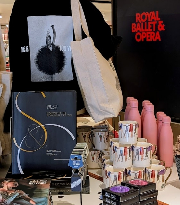
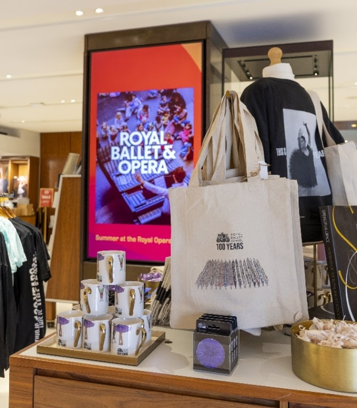
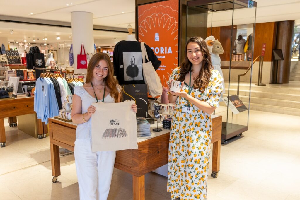
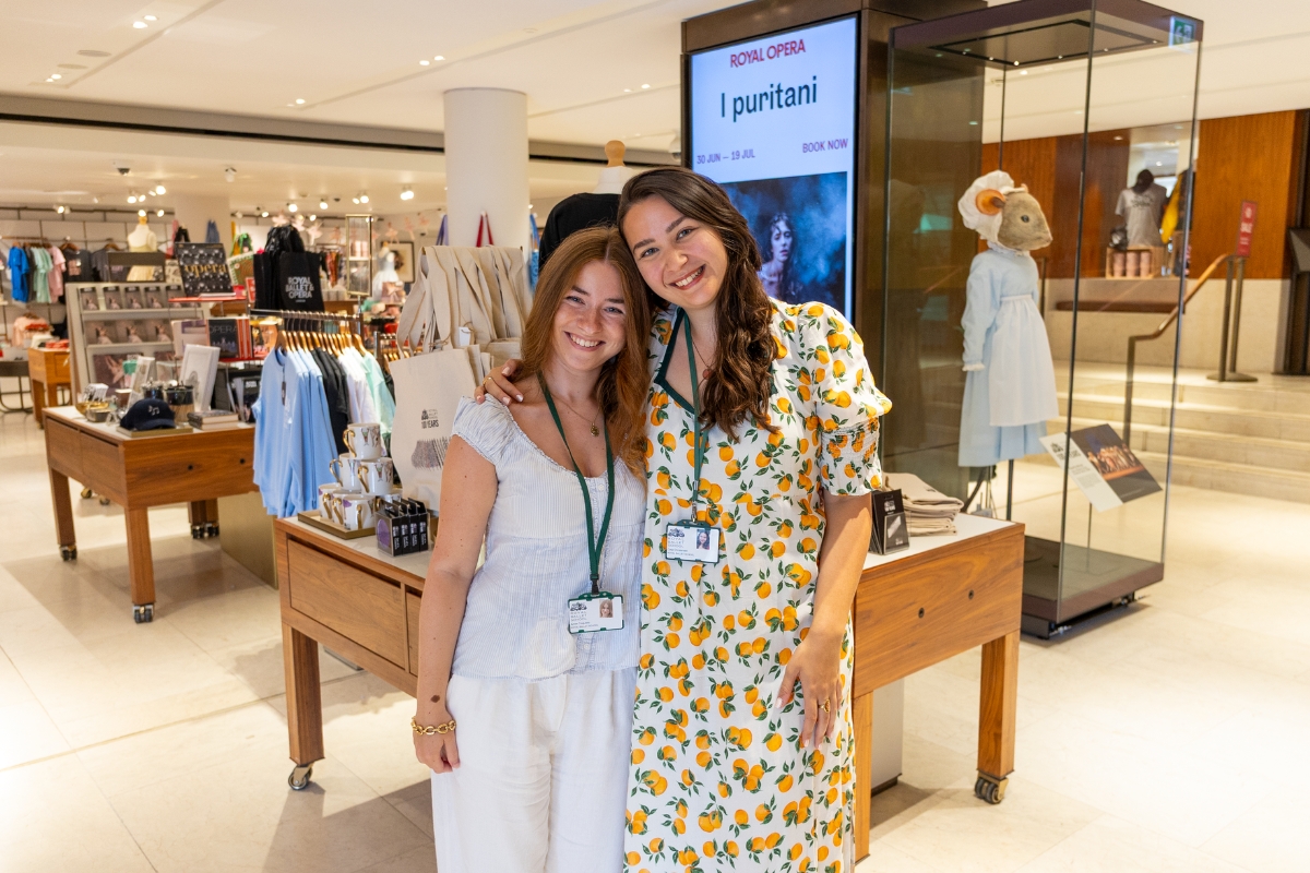
CC: We went to the Royal Opera House this morning and saw all of our merchandise on display. How does it feel to see your designs in the gift shop?
AT: It was amazing! For it to be front and center and set out so beautifully in front of The Tales of Beatrix Potter mouse costume worn by students – it was so cool to see it all laid out together.
CC: The placement was amazing! I thought it was just going to be tucked in the middle of the shop, but we were right by the Covent Garden piazza entrance. You literally can’t miss it. Shout out to Matthew Hunt, Head of Retail at Royal Ballet and Opera, for arranging such a perfect display.
AT: It’s all come together so nicely. The hero colours of the collection are the School uniform colours, which really pop against the cream of the tote bags and the black of the clothing.
CC: Yes, they also tie in with our Freed dancewear collaboration and the Covent Garden art installation ‘A Century of Becoming’ by Pauline Loctin. Let’s start with the tote bags while we’re on the subject, as that was the first design concept that you pitched for the merchandise range.
The Grand Défilé collection: tote bag, tea towel and magnet
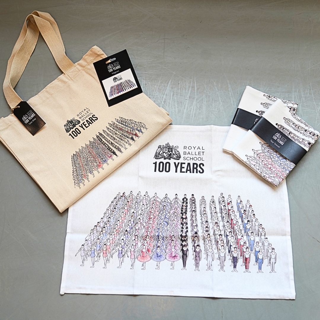
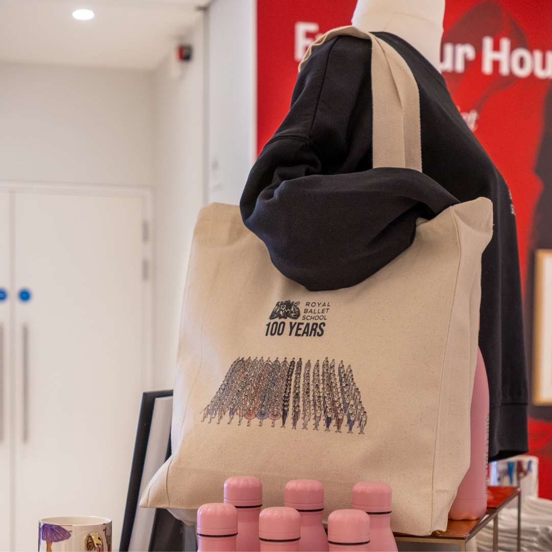
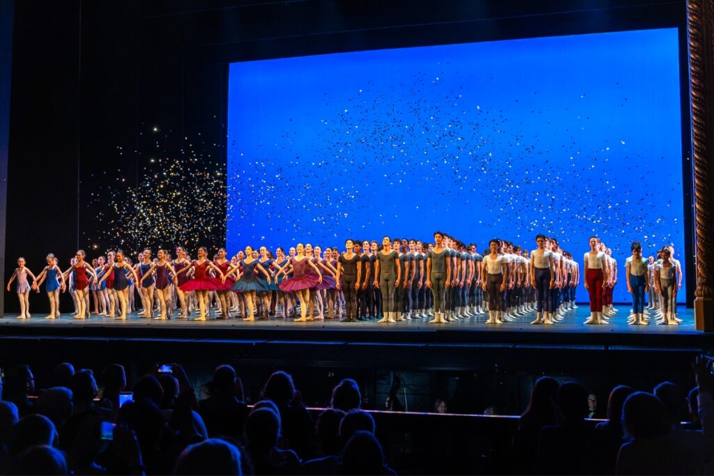
A highlight of our annual Summer Performances is the Grand Défilé, the spectacular curtain call that unites all full-time students of the School. This iconic final pose exemplifies the culmination of our students’ dedication and growth. As we celebrate our centenary, proudly show off this momentous snapshot with a tote, tea towel or magnet.
AT: When we were brainstorming ideas for the different products, I think we both agreed that the designs should encapsulate the School and what it represents. The Grand Défilé is such an iconic moment that brings the whole school together.
I designed it digitally with the software Procreate using a lot of different reference images and adjusting the numbers of students to make the lines more cohesive. We also experimented with using negative space in the background using stage curtains, but in the end, we decided to keep the focus on the dancers.
CC: That process seemed so painstaking. Every day, I’d walk into the office, and you were still working on colouring in the tutus!
AT: I wouldn’t say it’s a minimalistic design, but I didn’t want the dancers to have too much detail as there are already so many of them, and I didn’t want to overwhelm the piece. I started with line drawings, then I wanted the colours to be reminiscent of watercolour, as it is a delicate medium and would align with your mug. It was a lot of work, but I’m so happy with how it came out.
CC: They were also the first products to arrive and be released at the Summer Fair at White Lodge. They have been so popular.
AT: That was a good preview for how the rest of the collection would be received. It was one of the highest grossing Summer Fairs we have had, and all profit goes towards supporting the School.
CC: It’s also been so fun seeing the students try to find themselves in the illustration. Like you said, it’s an amalgamation of different reference photos and years, but some students are convinced that one of the little dancers is them.
AT: I like that! I hope that everyone, whether it’s them or not, can pick themselves out in one way or another and see themselves reflected in the artwork. I wanted it to represent all students, past and present.
‘Through the years’ mug
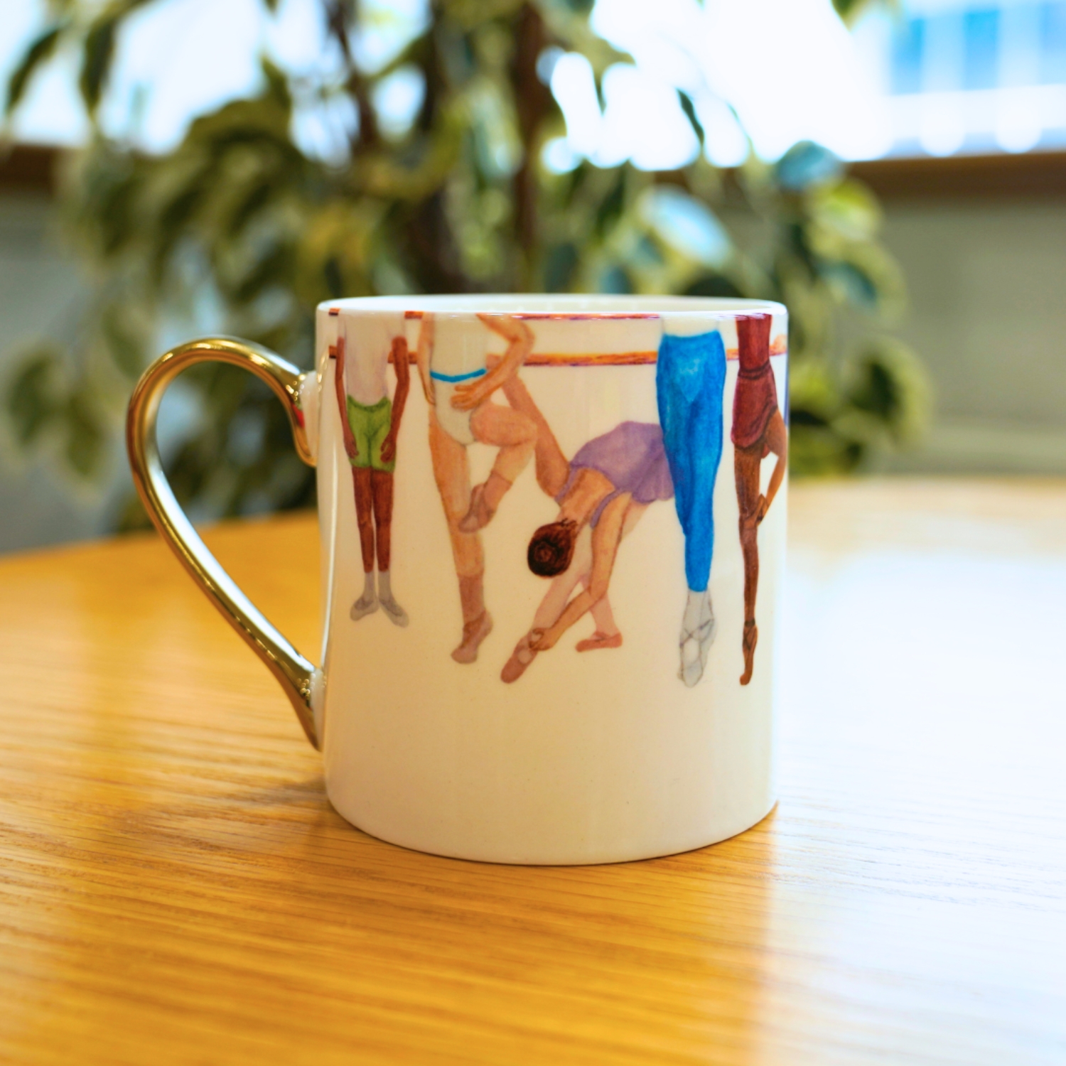
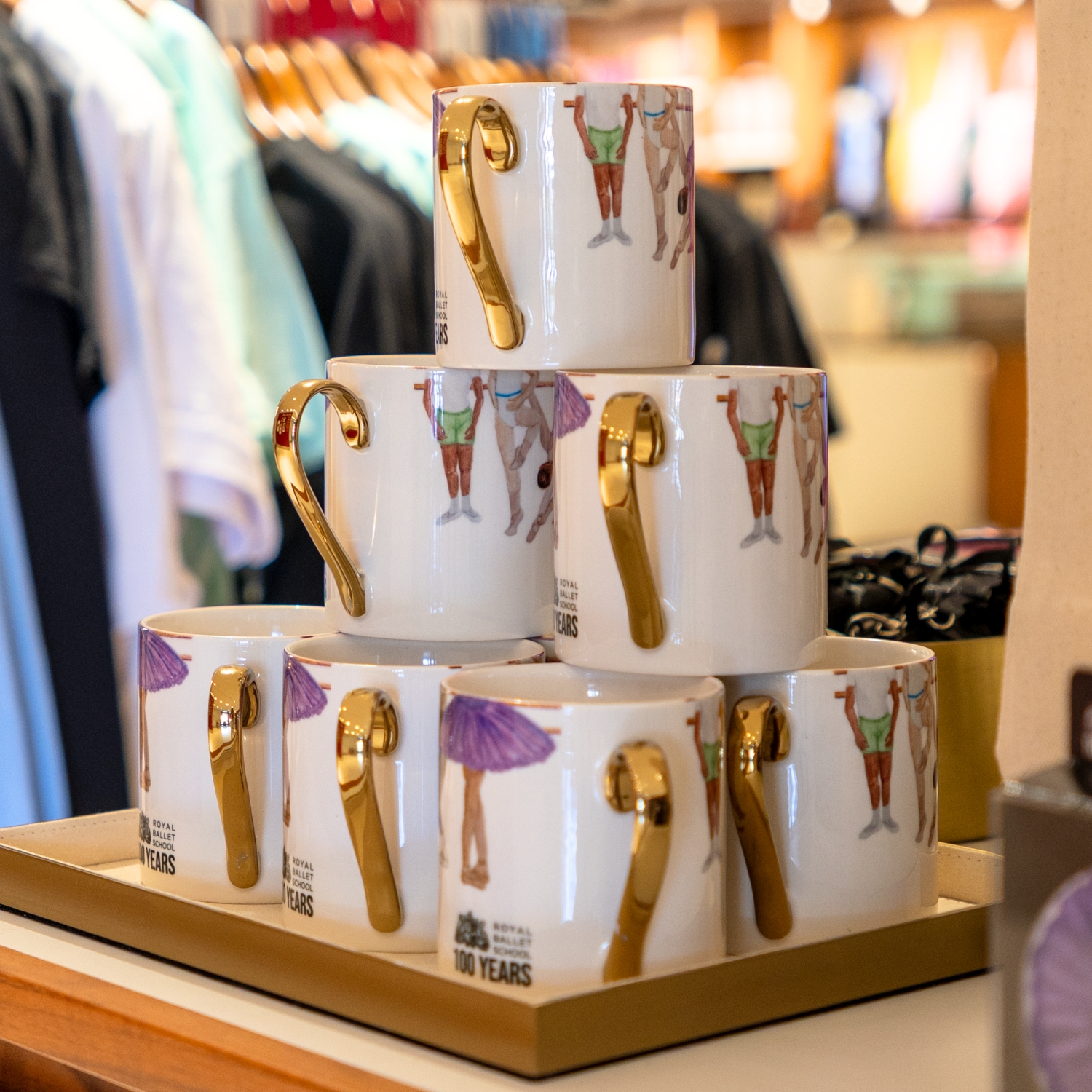
Celebrate the progression and transformation of our students with our ‘Through the years’ mug. Featuring 10 levels of training, from Affiliate to Associate to full-time training students, this wrap-around watercolour uniform design highlights the foundation of every ballet class: the barre.
CC: The inspiration behind this design actually came from a sample mug from our supplier, Temple Island. It was a Jane Austen Emma mug with the bottom half of characters in Regency era clothing wrapped around the mug. We’d never seen anything like that before. It made me think of the School uniforms, and the lip of the mug reminded me of a barre. Then we thought, instead of characters, what if it showed our students?
It was intimidating, because I’ve never done anything like this before, but I took my travel watercolour set to my local park and sketched from a bunch of reference photos. I tried to get a good mix of different poses, skirt lengths and shades of tights. The hardest part was making them all somewhat the same size while also showing the growth from the youngest Affiliate students to the Pre-professional Year students. You gave me some really good ideas about perspective and printing space, especially on a curved object.
AT: It’s a very different experience creating a 2D image and then working out how it will look when it is curved and whether doing so will distort the image.
CC: I think it also ties in well with the Défilé design because it’s another image where all of the students are together. That’s something we talked a lot about in the initial design process: what visually represents the School. Initially, we thought about White Lodge, but it is used in a lot of our existing merchandise.
AT: When you think about iconic imagery, you tend to think about the architecture, but it was interesting that our designs ended up being all about the students, and I think that is really special.
CC: The students are the heart and soul of our collection, which is true of the School as well.
Tutu coasters
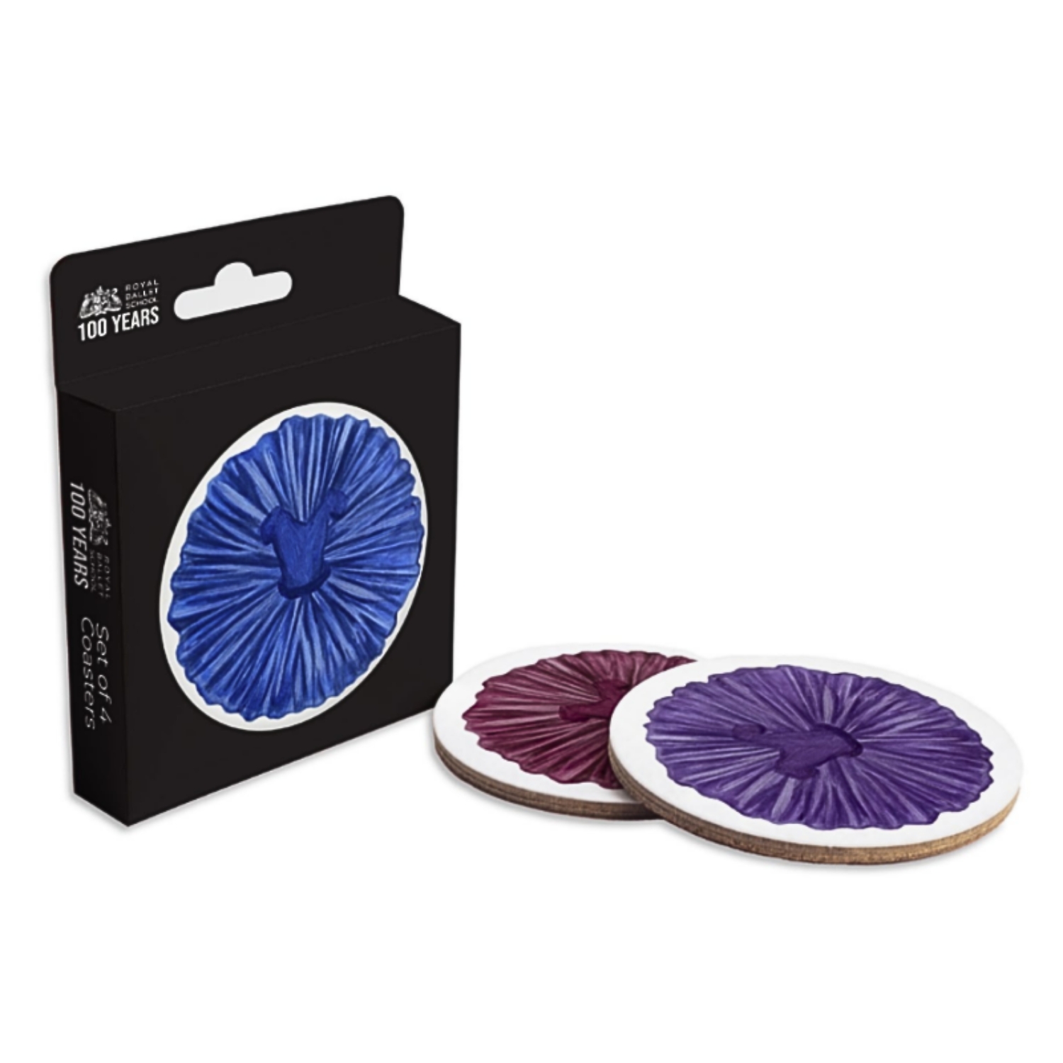
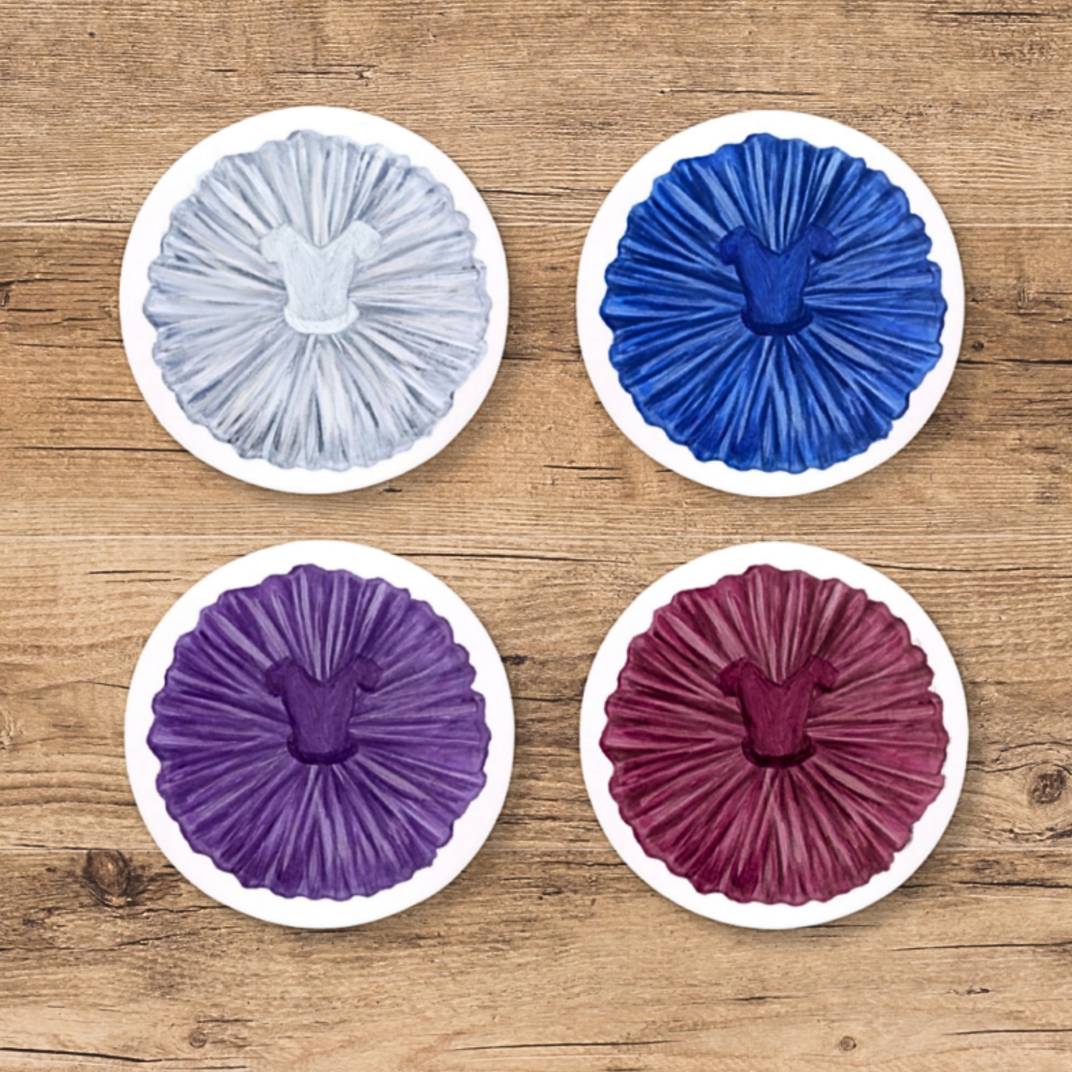
Featuring the School uniform leotard and tutu colours, as seen in our studios and on stage in the annual Summer Performance Grand Défilé, these painted tutu coasters add charm and beauty to any coffee table. Create your own tutu tree at home by storing them in stacks, just as we store our practice tutus in the School.
CC: The other products came from those initial two ideas: the Défilé and the ‘Through the years’ mug. The tutu coasters came very quickly after that. I think we were talking about different coaster shapes, squares vs circles, and you had done a really beautiful sketch of some weights. We were thinking about incorporating healthcare elements into them. For a while, we were just sketching different ideas and seeing what would stick.
AT: I think the tutu trees were just starting to emerge outside wardrobe at that time.
CC: Yes, every day, the stack of tutus would get higher and higher. Then you did a gorgeous illustration of the tutu tree, and then we thought about the round coasters and the idea of building your own tutu tree at home. Although I used watercolour for the mug, I wanted to use acrylic paint for the coaster design to make it a bit richer, a bit thicker. I love the texture of acrylic paint – it’s so fun. I’m really happy with these. I think they are so cute.
AT: It looks great partnered with the mug.
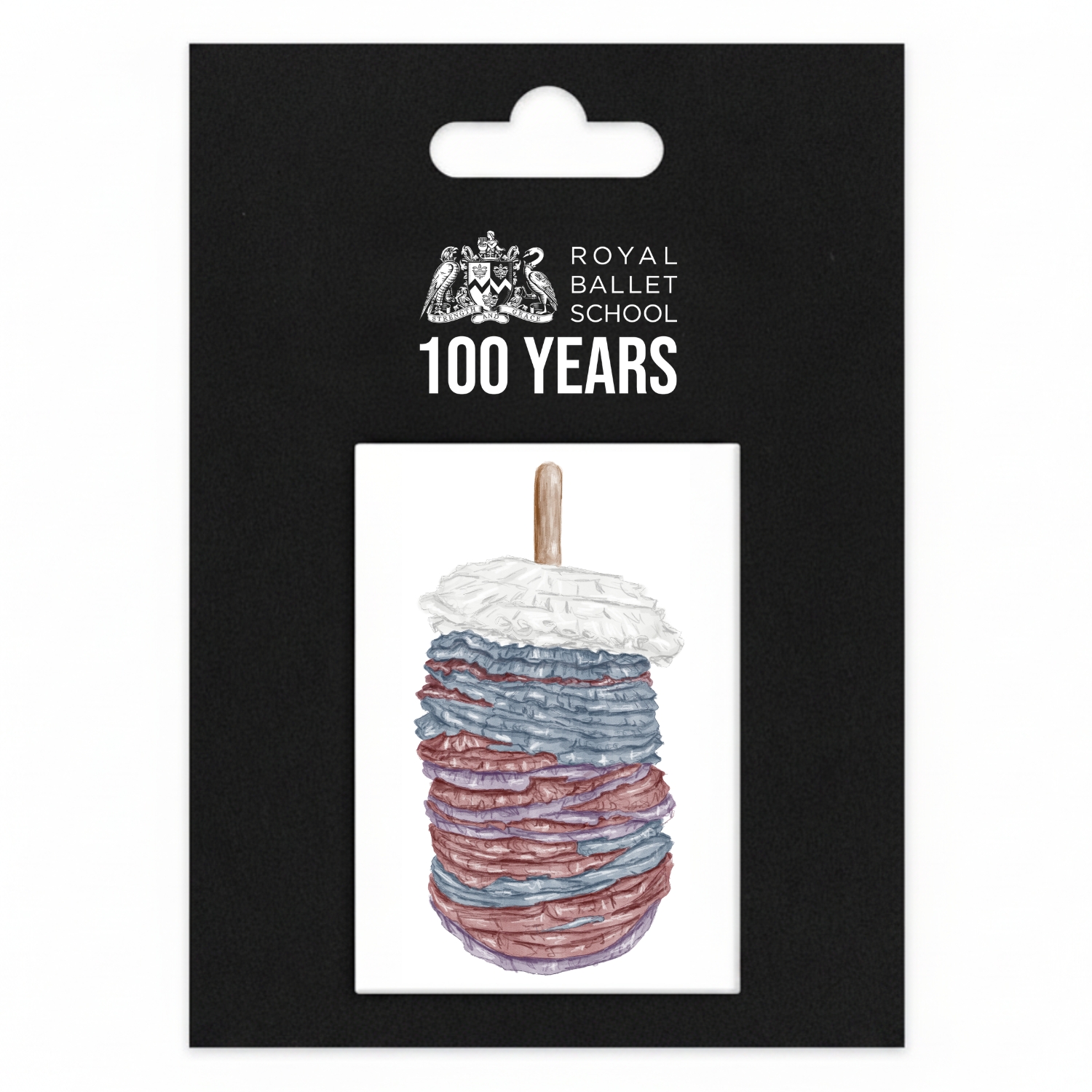
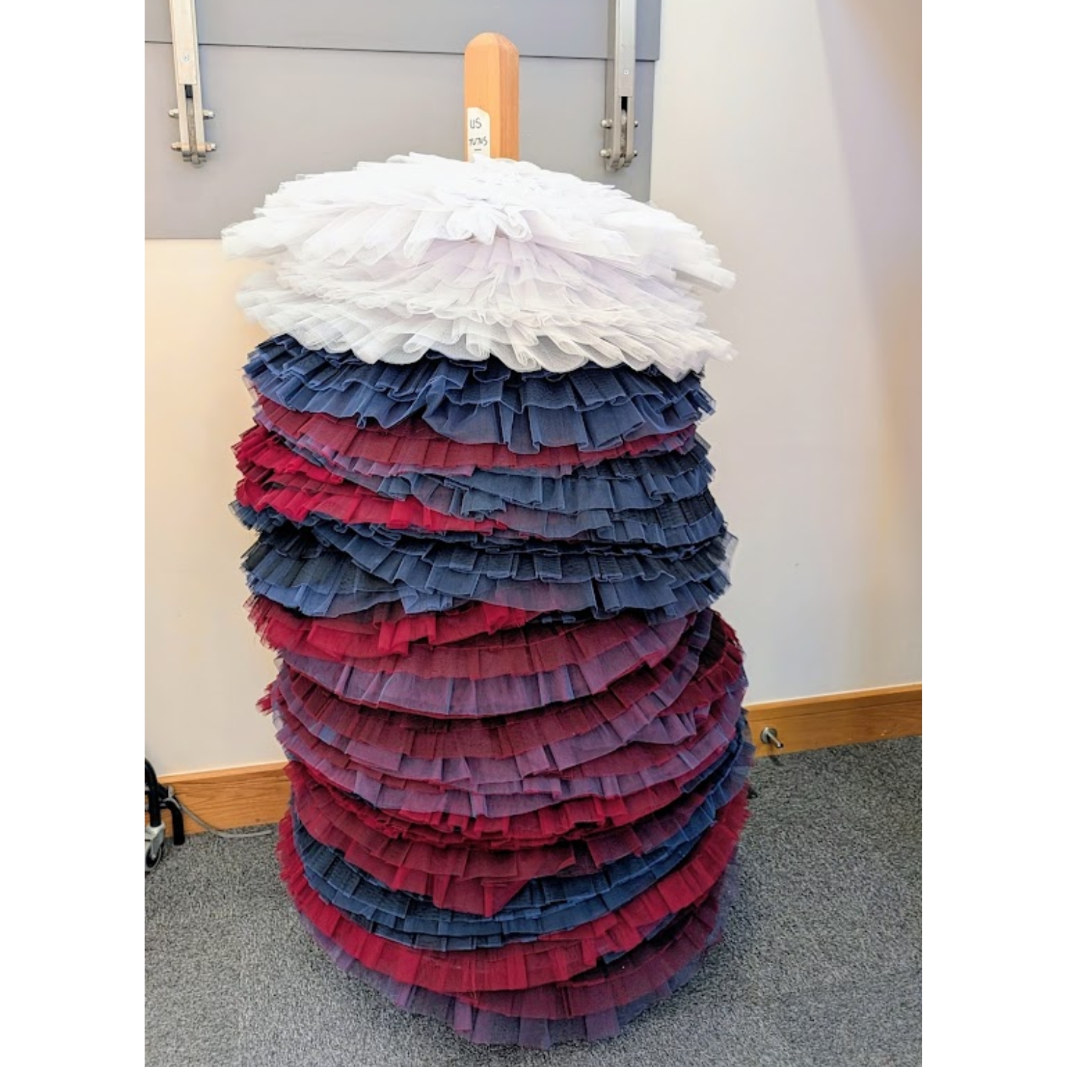
An early magnet concept sketch by Aimee, inspired by the growing tutu tree outside of wardrobe at Upper School. The tutu uniform colours inspired the collection’s colour scheme.
The Bridge of Aspiration magnet and keyring
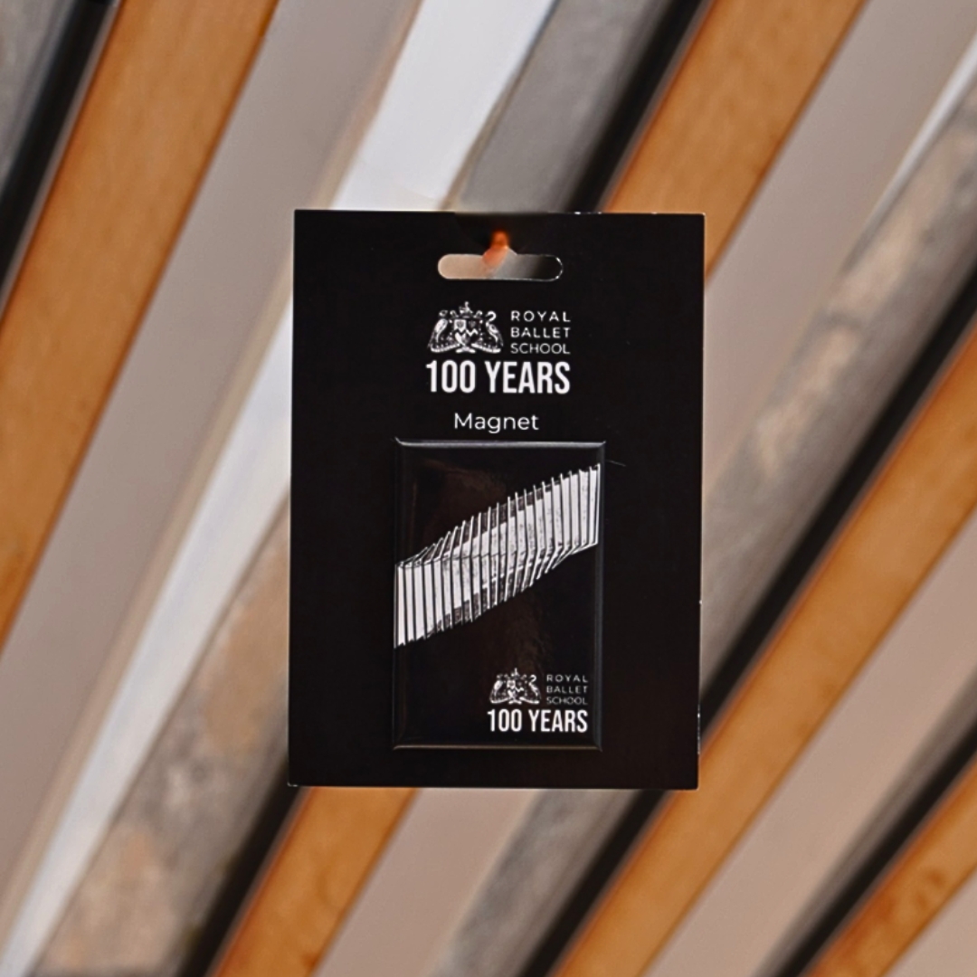
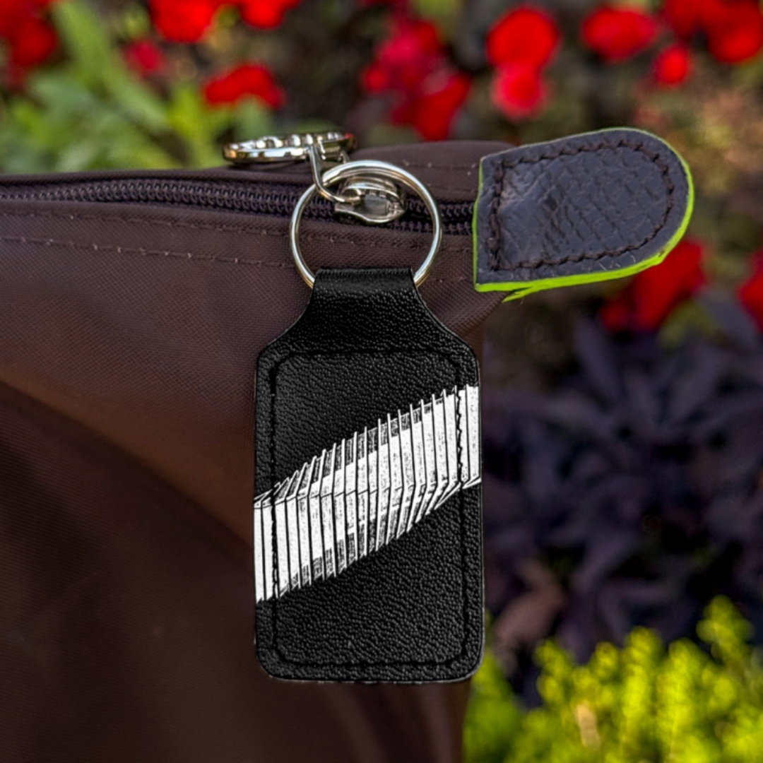
Remind yourself of your own goals and aspirations with this Bridge of Aspiration illustration magnet, inspired by the award-winning architecture connecting the School and the Royal Opera House.
CC: Finally, talking about iconic imagery, one illustration that stands out in the collection is the Bridge of Aspiration, which was another experiment. I looked at the initial architecture sketches of the Bridge from WilkinsonEyre, the designers, and I really liked the movement in the lines. It’s similar to how Pauline Loctin was inspired with her paper folds. I like how the architecture creates so much movement even though it is structured and solid. The symbolism of it also ties back to the students: crossing the Bridge, entering a company and going out into the world. We have had a few prints of the Bridge and a mug design before.
AT: But those were from the inside of the Bridge. We haven’t actually had one from the outside that shows the unique twisting design of the Bridge.
CC: That’s true. I had been working on a London ballet map for the Covent Garden takeover at the same time, so I’d already been playing around with painting the Bridge. But this was my first attempt at using digital art. Shout out to Aimee because she helped me so much. It’s opened up a whole other world of art-making for me.
AT: Digital art is an interesting medium because at first, it is complicated to learn, but then it opens up, as you said, so many doors. You can manipulate it with so many different mediums, and I like the fact that you can delete elements and experiment with different backgrounds without having to commit to painting them on yet. It could be seen as a great form of collage when you’re experimenting with designs.
CC: Yes, I completely agree. You can edit the layers as you go, which is something you can’t do with paint or other physical media, and that was really helpful even for the mug. We moved to digital art to do edits because I think we had seven or eight rounds of feedback of adjusting tiny little details. We had the artistic team approve all the poses and make sure they were all technically correct, and then there were perspective shifts we wanted to make. Editing on digital was so nice, and now I have a new skillset.
AT: It’s nice because you can do both. You can paint a wonderful image with watercolour or acrylic and then you can add finer details on digital. It’s a great tool to experiment with.
About the artists
AT: This is going to sound very cliché, but I’ve been making art for as long as I can remember. I started digital art during lockdown. I had so much time on my hands, and it was a new medium to experiment with. I also did GCSE Art, A-Level Art and then a Fine Art Degree, which gave me an entirely new perspective on art. There always has to be a ‘why’ in a Fine Art degree, and I think that was helpful for this project because we needed our collection to be cohesive and understand why we are making certain decisions, like focusing on the uniforms and the colour scheme. I didn’t make any art like this in university. The more illustrative style is something that I haven’t done a lot of before, but I really enjoyed it.
CC: What sort of styles do you usually gravitate towards?
AT: I mainly did acrylic and oil painting before university. I was never very good at watercolour, but I did a lot of portraiture and realism. I also enjoyed, which is an unusual one, a biro pen sketch, with hashes and intertwining lines. I found that really interesting, spacing the lines out or keeping them close to create depth. I love it. Once I started my degree, I fell into photography, looking at alternative photographic processes such as cyanotype. The experimentation and manipulation of photography is an interest that lends itself to digital drawing, in a way.
CC: Yeah, I think I’m more into textured paints than detailed line work.
AT: Tell me about your art history!
CC: Mine is similar to yours – I don’t remember a time when I wasn’t making art. My mom still has all of my childhood doodles and drawings. She always carried around markers and a notepad wherever we went because I loved drawing, and my dad had a huge box of crayons. But unlike you, I never really studied visual art formally. I took classes all four years of high school, but they were more of an extracurricular activity. That was a class just for me, and the rest were to get me into college. I studied English Literature and Dance in undergrad, and then I did my Master’s in Dance Choreography and Performance on a Fulbright scholarship. I wasn’t actively choreographing, more researching philosophies behind performance. I created an artistic notation style in my dissertation, less like a formal notation style that documents dance and more of an impression of movement. My job now is more writing-based, but I always paint birthday cards or gifts. I’m always creating something.
AT: I think it’s lovely that it’s such a passion for you. You do so much in your own time, and now you get to create work for an amazing collection within the School, combining both of our creative interests.
CC: This past year has been really surreal. I think there’s some imposter syndrome because I’m obviously proud of my work, but I’ve never done anything like this before, and selling your work is terrifying! But I am so proud of the work we’ve done, and it’s been so much fun collaborating with you.
AT: Obviously, we make a lot of art outside the School as a hobby, but actually seeing people buying it or holding our products is an amazing feeling.
CC: It’s also been really cool because we are part of the Audiences team, we’re in the School nearly every day and we are immersed in all of the centenary events that we produce. It’s been really nice to see every step of the process and work with our incredible team who have been so supportive.
AT: That’s what makes it so special. We know our team. We know what makes the School special. Having that inside perspective has really helped us make such a successful collection.
Learnings and takeaways
CC: The hardest part for me has not actually been the art making, because I think, like we’ve said, it’s so natural to us, and it’s something we do all the time. The hardest part is advocating for yourself and being confident. Art is something that is so personal. I think that’s why it feels so scary to give it to the world, because it’s a part of me. It’s part of my soul. I put so much time and energy into it and feel very attached to my work, so putting it out in the world is nerve-wracking.
AT: It’s a very vulnerable thing to do.
CC: Exactly. But I think part of the process of being an artist is advocating for yourself, knowing your worth and having the courage to put yourself out there.
AT: I think my biggest learning is that it’s not just about making the piece of art. It’s also understanding how it works in a commercial setting. I think learning to adapt is probably my main takeaway, experimenting with different shapes and sizes and editing the work to make it fit the products. One of my jobs was researching different suppliers and gathering different samples to compare quality. It was really interesting to see behind the scenes of that process. I feel like I’ve had a well-rounded experience designing these products.
CC: It’s been an absolute pleasure to work with you.
AT: I think we’ve worked together so well, collaborating and sharing ideas. I couldn’t think of a better person to have done it with. I think we’ve worked amazingly together, and we’ve created a brilliant collection.
CC: Let’s do it again sometime!
Catja Christensen is the Marketing and Communications Executive at The Royal Ballet School and joined the School in 2025. She enjoys interviewing students, staff and guest artists for news stories and crafting eye-catching newsletters.